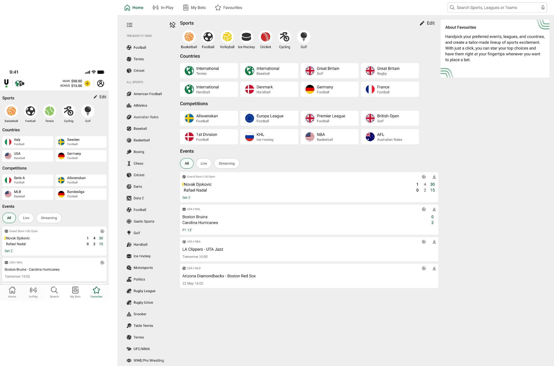
Favourites
Designing Favourites
In this project I designed the Favourites feature, which allows the user to favourite events, leagues and sports. This allows the user quick access to a page where all of their favourite items are stored. It was designed for app (main focus), mobile web, and desktop.
Background
One of the most important features according to surveys of the users, is a way to favourite different items such as matches, sports, and leagues. This feature was also highly requested from the business area and other stakeholders, so it was no surprise when this project was approved to start.
In this project I worked closely with stakeholders such as business, developers, and another designer.
Data and insights
The only data available was on the amount of users who used the current favourite functionality, which was just a simple way to store current in-play matches at the top of the in-play page. While this feature was not used so much, it was important to a lower amount of VIP users so I started thinking about how we could enhance the current functionality while at the same time building a much better experience for the whole client.
UX research and design
Everything was designed in Figma and I had to consider all devices, our design system, and our already delivered projects on other parts of the product.
Usability testing was conducted twice during the design process.

Competitor analysis
At the start of a new project I usually conduct a competitor analysis to see what the competitors are doing in the area, both the good and the bad. This is a great way to quickly get insights into industry standards, and to find things where we can take the lead by delivering something that is either not done yet or at least better than what the competitors are currently offering.
The image to the right represents some of the apps I looked at, and as can be seen I prefer to be structured and systematic in my process and go through each competitor in detail.
Some of the findings in short:
- All sports related apps use a star icon as opposed to e-commerce apps that often use a heart icon.
- Some apps gather all of the user's favourites in one view while some spread them out to different views.
- Some competitors use onboarding to explain how favouriting works, and some do not.
First sketches
After having learned about what the competitors are doing related to favourites, I was inspired to start being creative. I started to sketch possible ways of how favouriting could work and how it all would align with the rest of the app. I came up with two different initial concepts:
Concept 1: The user taps and holds down on a card/element of the page to open a menu with the background blurred.
Concept 2: The user taps a star icon to favourite that specific card/element.
I had a feeling that concept 1 possibly would be more difficult to implement since we had never used that kind of interaction before, but I was not sure so I was really curious to ask the dev teams.
Workshop
- I presented my findings from the competitor analysis (~15 min).
- I started an exercise where each participant were supposed to list some of the best and worst examples of favourite functionality, either from my competitor analysis or if they had any other example. We then voted for the best of these examples and discussed why we all thought that way (~20 min).
- Now was the time to share my two initial concepts. I presented them and asked each participant to to write down pros and cons with both. Then each participant were asked to briefly explain their thoughts (~20 min).
- After everyone had shared their opinion the next step was very clear, but just to make it official I suggested a quick vote on one of the two concepts to go forward with, and the decision was almost unanimous (~5 min).
Business also shared their requirements, for example it should be possible to favourite events, sports and leagues.
Now with all requirements in place and questions asked, it was clear that the second concept was the one to continue working on.
Design iterations
Now I could go on with the exploring the design. The screenshots below are examples of the mapping out of all different items that would be possible to favourite, and all different pages where these items can be found. This step was important to document to make sure that no scenarios were missed out and that whatever solution would be chosen, would be working the same across the client.
After mapping out the different items and pages of favouriting it became clear to me that we could afford to add a star icon on the items that could be favourited. Before I had looked into this in detail I was afraid that some cards or pages would already be full with other icons and elements so that it would be difficult to fit, but this was not the case.
I also needed to design a Favourites page to store the favourites in. This was already part of my sketches but until now I had not thought so much about it, but it would not make sense to not have one easily accessible area in where to find all the favourites. So after checking with stakeholders it was fine to add a Favourites tab to the navbar. This would allow the user a quick access to all their favourites, and now I needed to design how that should look.

So I needed to design two main things: The actual favouriting of an item, and the Favourites page.
I wanted the design to be consistent throughout the client, and that the user would fully understand the functionality and how to use it. I decided to iterate a bit on the concept from earlier, and added the snackbar from our design system. I was curious if the users would like this interaction and find it useful, so I built a prototype and conducted a usability test with 5 users. The results were mixed. After tapping the star icon in the top of the page, the snackbar appears in the bottom of the screen for 5 seconds. Some of the users would not pay attention to it, while some would see it and understand what it meant, however it annoyed almost all of them that it was on the other side of the screen of where they just had tapped. This was unfortunately how it was designed and it was not possible to move it to the top for example.

I also had an idea for the favourites page (where the favourites are stored) that I wanted to usability test. It consisted of a page with separate tabs for the differents items (events, sports, leagues). I made a prototype and gave tasks that allowed the users to explore the prototype. I tested with 5 users, and some of the findings were:
- Some users that would favourite many different events need scrolling or pagination, and therefore the events would probably be bestat the bottom of the page.
- I needed to cater for a scenario where favourited items would become unavailable, for example when a favourited league currently has no events.
- It was annoying for the users to have to switch between the tabs to see different items.
Continued iterations
I continued to iterate on the design, taking into account findings from the usability testing as well as stakeholder feedback. I had different ideas in mind and I wanted the design to be consistent with the rest of the client, for example using the same icons that already existed in the client. After some iterations I had a design that I was happy with. I did another round of usability testing for validation, and the design was received positively by the users. After some final polishing I was done!
Final design


The final design consists of:
- Star icons on each item that you can favourite (sports, leagues, events).
- A favourites page where all favourited items are stored.
- Edit functionality to be able to remove and sort the favourites.
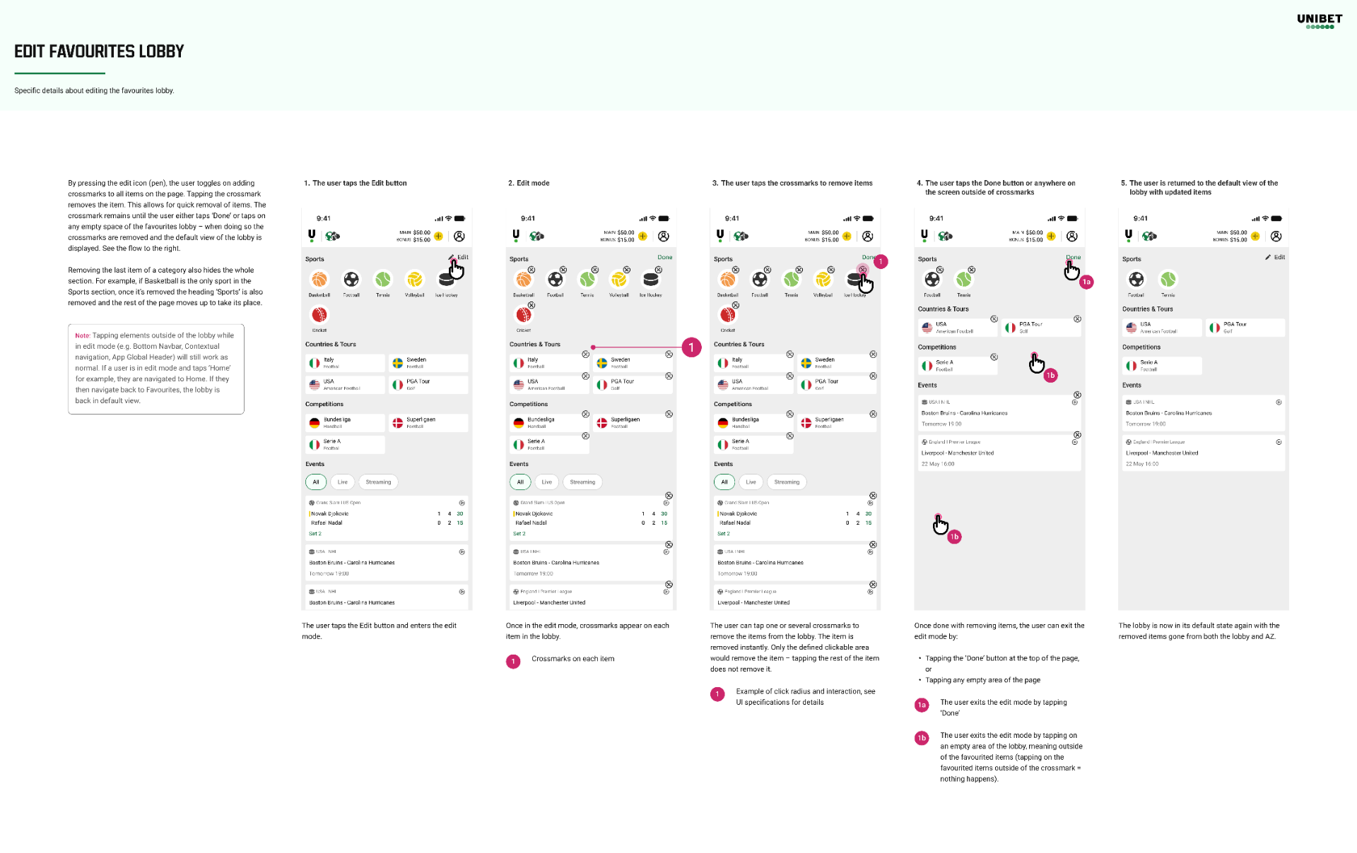
The screenshot below is an example of my design specifications, showing the user journey for the editing functionality.
Future iterations
In future iterations I would like to explore the other concept I had where the user would tap and hold to open a menu to select favourites. It would be very interesting to see how this interaction would perceived by the users. Additionally I would also like to explore more sorting and filtering options in the favourites page. Potentially the users would like to have more customisability over how the items are presented.
An a/b test was planned to be set up together with the analytics team, to see if the favourites feature would increase conversion.
After successfully delivering this project, I felt I had created a user-friendly solution that was more than just an MVP, but as always I instantly started to think of ways to improve it further in the future.